Prescription Wine
Services: Visual Identity, packaging and copywriting
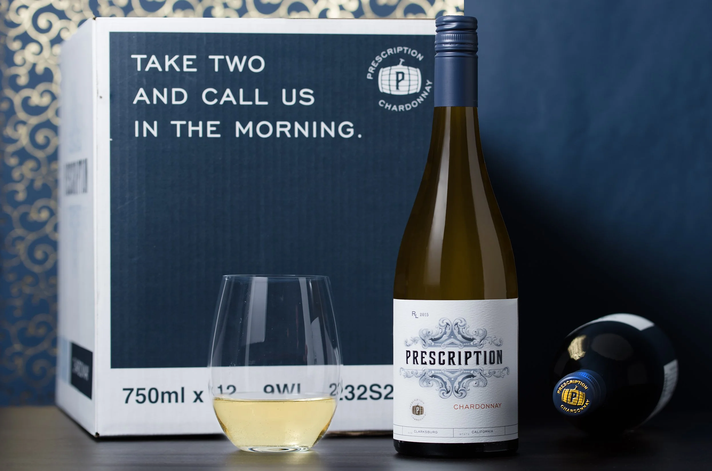
Approach: Nothing can replace the age-old prescription of self-care, especially when it drinks like this chardonnay. The approach to the brand’s visual identity was to focus on vintage apothecary concepts through a modern lens that works hard on today’s shelf. Multi-level embossing/debossing, blue and gold foiling decorate this 280 degree label wrap and communicate a sense of craft to the story. ~ Just like the Doctor ordered, Take two and call us in the morning ~